Launching our own web app
I launched a functional web app with a couple of friends to help make thrift shopping more accessible, reduce textile waste, and help out local businesses.
Team side project
March 2022
Saying heck no fast fashion
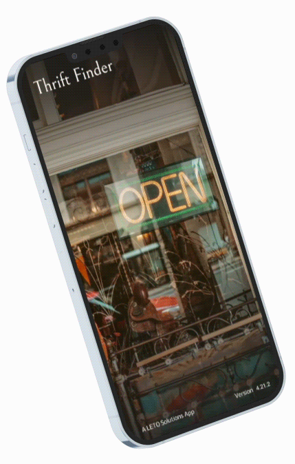
My two developer friends and I launched Thrift Finder, a web app that attempts to mitigate the waste of the fast fashion industry. Textile waste is a significant contributor to environmental degradation, with fast fashion alone responsible for substantial CO2 emissions and exploitation in developing countries. Thrift Finder addresses these issues head-on by embracing the principles of circular fashion, which promotes the longevity and recyclability of clothing. Our goal is not only to make sustainable fashion choices more accessible but also to break down barriers to participating in circular fashion.
Jumping into research
Our journey began with a hypothesis: making thrift shopping more accessible to older, non-tech-savvy individuals would benefit everyone. Through user interviews, we gathered insights on shopping preferences, barriers to buying second-hand clothes, and motivations for donating. This research led to the creation of our user persona, Dolores, symbolizing our target demographic who values simplicity and clarity in their shopping experience. Dolores was based on some of these key findings:
5/5 participants look for close stores with positive online reviews.
4/5 participants donate where they’re familiar with the place.
4/5 participants want to know what’s in stock.
4/5 participants shop and donate where the location is convenient.
Landing on a solution
The challenge was clear: simplify the thrift shopping and donation process while educating users about textile recycling. Since we wanted to launch this app within seven weeks, I decided to include the two developers in the design process early on. As you can see from the above sketches, the developers were able to vote on solutions and immediately tell me which features were doable and which ones needed to be trimmed down in order to be meet technical constraints. I found this extremely helpful, as I was able to quickly come up with other ideas before going too deep into the prototyping stage.
We all agreed on focusing on a Yelp-like application that displayed ratings and geographical locations of donation centers and thrift stores relative to the user. If there was enough time, we would have loved to have displayed additional information such as which items of clothing were accepted or needed at certain stores.
Our users struggled with the initial prototype
After quickly stitching together a low-fidelity prototype, I began testing our first ideas with five different users. I asked them to interpret what certain buttons/filters mean and to complete a few general tasks such as finding an ideal store to buy used clothes, figure out how to donate old and unwanted clothes, and lastly figure out what to do with clothes that are in too bad of a condition to be used again. I made these changes based on my findings:
3/5 users thought that the app was for finding both new and used clothes. To make it clearer that it is for used clothes only, a thrift shop was added to the background of our loading screen animation and the app name was changed to Thrift Finder.
4/5 users did not find it necessary to filter stores by price since most thrift stores sell items at a bargain. We removed this to clear up some real-estate.
2/5 users wanted to find out what stores needed their items while donating, so we added a filter for this and replaced the accepted items with a tooltip that links them to a donation guide.
This time the devs were struggling
The second round of usability testing went much smoother. Only one user had a hiccup, as it took them a minute to understand that this service was for used clothing only. To add additional context, we replaced our stars rating system with t-shirts. With most of the usability issues out of the way, I handed the prototype off four development, and there were some technical concerns. The developers hit a snag while trying to implement the Yelp API we used as a base for this app. So I was tasked with trimming down the product in order to meet our initial deadline. These are the features that got pushed to the next iteration:
No more internal GPS or filters: A core need for our users is to be able to locate these thrift stores and donation centers, so we decided to have the “Get directions” button open up the stores’ locations in Google maps to avoid having to build an internal GPS. Filters were also eliminated as it proved very time-consuming to allow users to filter stores buy the items they sell and the items they need.
No more tooltips: Adding tooltips throughout the app also proved to be time consuming, but user still needed some additional information on donating and recycling clothes. For this, we opted for informational guides in the app’s menu.
Our final solution
Although it pained me to slim down our product, I am very happy with the amount of key user needs we were able to meet. Thrift Finder currently has these three core features: searching for places to buy used clothes, donate used clothes, and recycle used clothes. In the short time my team had working on this, I learned a lot about balancing user needs with tecnical constraints. One lesson that will forever stick with me is that it doesn’t matter how awesome a feature is if it can’t be implemented by the developers.
As for next steps, I would love to add the features we had to trim down. We also have planned to convert this web app into a downloadable native app so we can get valuable feedback in the form of online customer reviews and number of downloads. I am very content that I was able to eliminate almost all of the usability issues we’ve stumbled upon, but I also am content with the impact I had on my team. Here is what my developers had to say:
-
![]()
"I admired his thorough research and investigative process when making decisions about our UI. He’s an empathetic designer and really knows how to put himself in the user’s shoes to develop accurate User Stories."
LORRAINE LESLIE
FRONT-END DEVELOPER
THRIFT FINDER -
![]()
"Working with Oscar was truly a pleasure and an eye-opening experience. His positive attitude, willingness to work in a team, and flexibility made him someone that I would want to work with again someday."
EMILY SARANI
FULL-STACK DEVELOPER
THRIFT FINDER