A digital healthcare marketplace
Team client project
November 2021
I worked along three other designers to design an online marketplace for employers to shop around for digital health benefits and submit their Request For Proposals.
Date
November - December 2021
Role
UX Designer & Researcher
Team B2B project
Tools
Figma, Google Meet, Zoom,
Calendly & Slack
Currently changing the design of this case study to match my site’s theme.
My Process
I use the Standford d.school’s design thinking model as a rough guide to my design process. I’m very thorough, so feel free to jump to different sections. I promise it won’t hurt my feelings. 😊

Empathize / Define

Ideate

Prototype / Test

Iterate
Overview
In this team project, I took on the role of UX designer & researcher for Standard Care, a startup healthcare company.
I had the chance to work with three other designers to create an online marketplace where health benefits providers can sell their digital products and services.
The Team
Alice Liu - Stakeholder interviews & UI elements
Oscar Coello - Usability testing & animation
Tonya Montgomery - UX writing & branding
Cassie Mattson - Accessibility & color

The Client:
Standard Care aims to match buyers with providers of digital health solutions. These solutions can be subscriptions to wellness apps, online coaching, and other health services that can be added to employee benefits packages.
My role:
My team worked closely with a software developer and our stakeholder to prototype an enterprise web app. Though we all contributed to every step in the design process, I led every usability test and focused on motion design and UX writing.
The problem:
There is no platform for providers to share their digital solutions or manage requests from potential customers. Because of this, providers resort to ineffective methods like cold calling to reach these customers.
As a startup company, our client gave us additional constraints during this project.
The constraints are as follows:
Low budget
Small customer base
No prior UX research
No dedicated team of software developers
The solution:
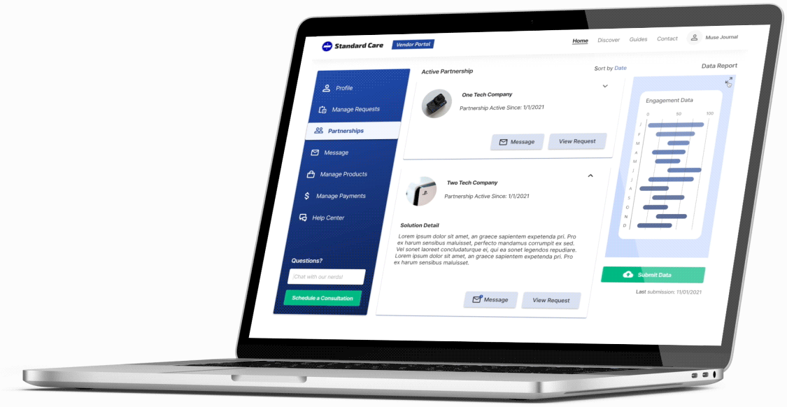
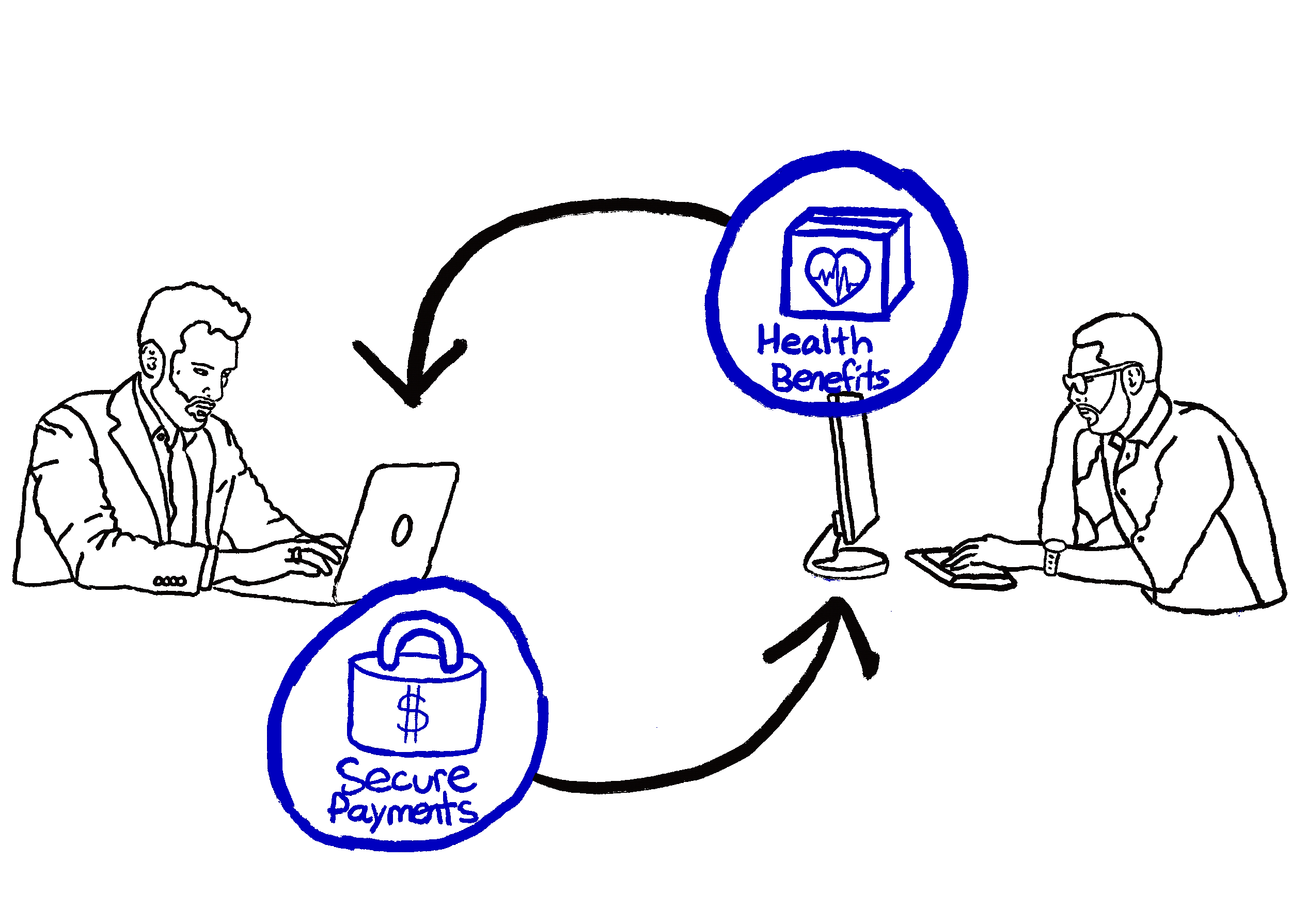
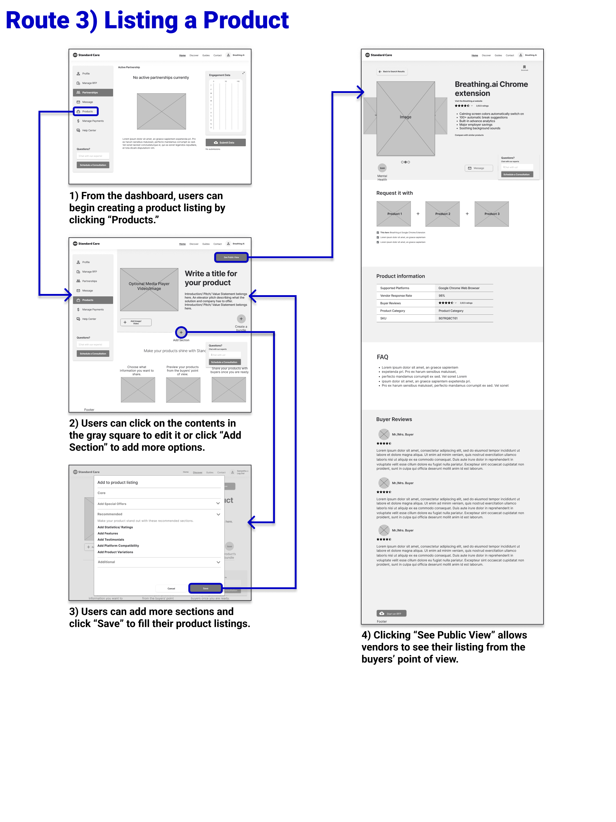
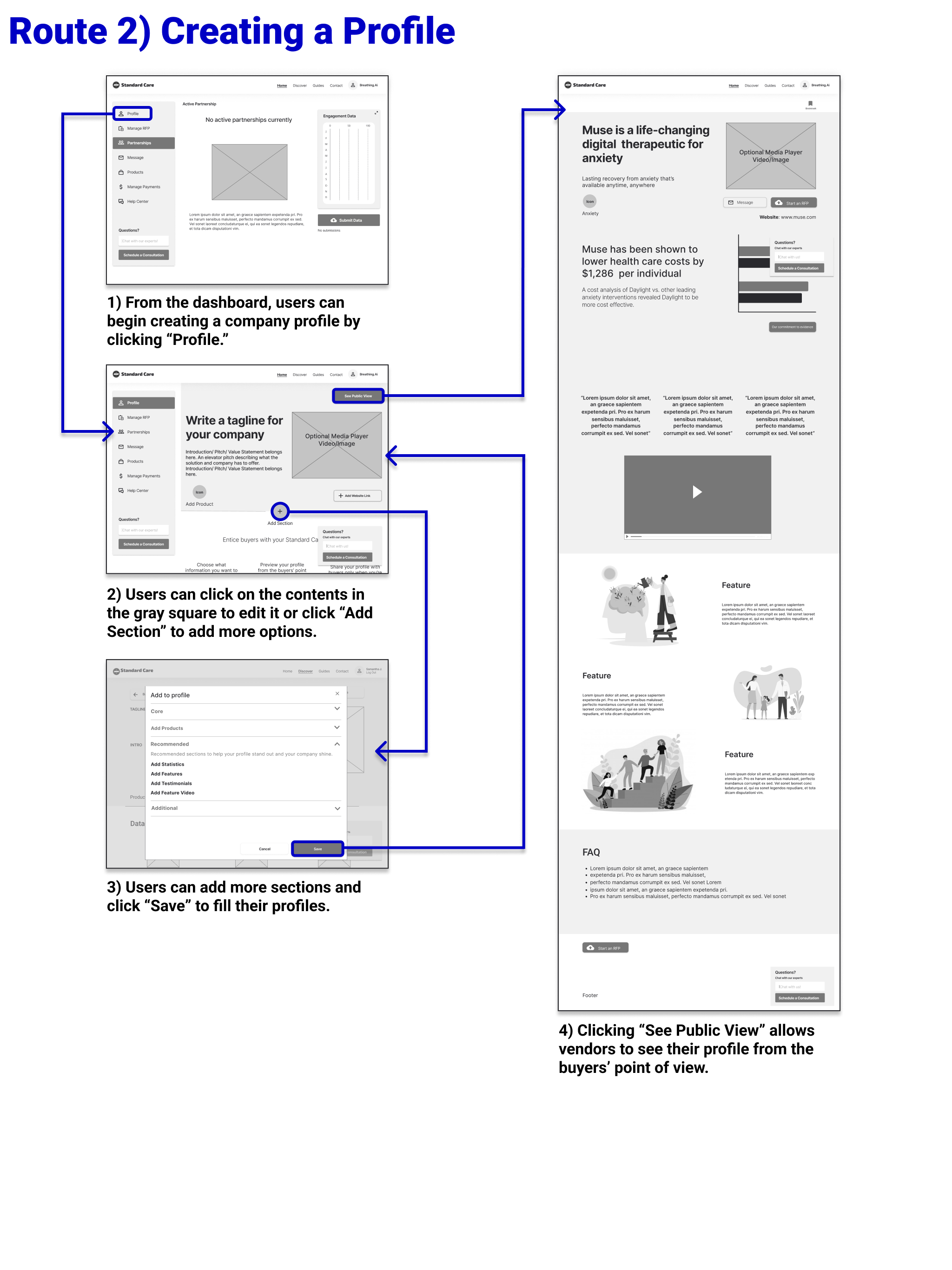
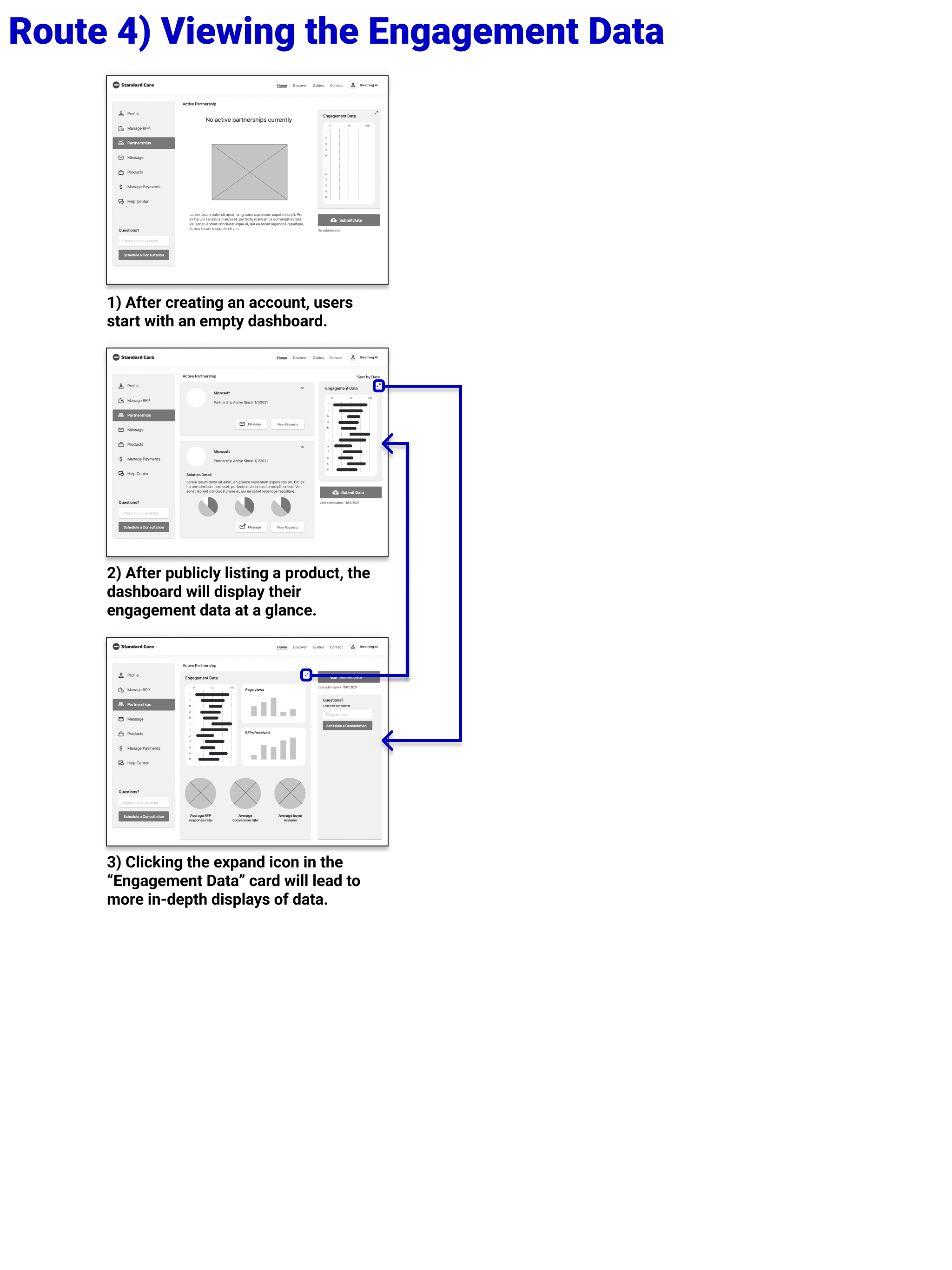
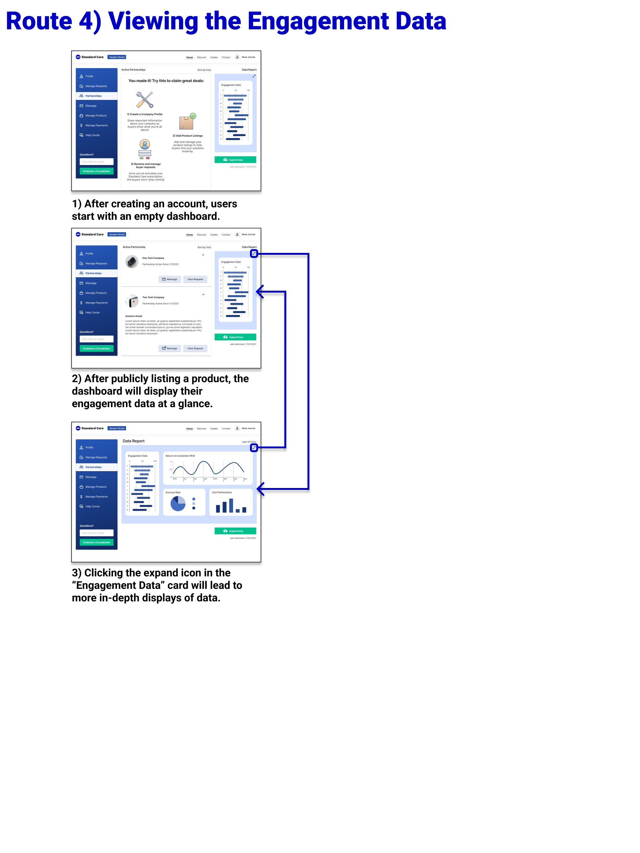
Introducing the new Standard Care Vendor portal, an enterprise app that allows providers share their digital products and services in an open marketplace, manage requests from buyers, and track their real-time engagement data all in one place.
Here’s how it works.
Kickoff Meeting
Standard Care’s CEO wants to help people shop around for digital health services.
Our client aims to create a marketplace to help people buy and sell digital health solutions. These include apps, tele-health appointments, and other health-related services that companies could offer as part of their employee benefits packages.
Our project goals are as follows:
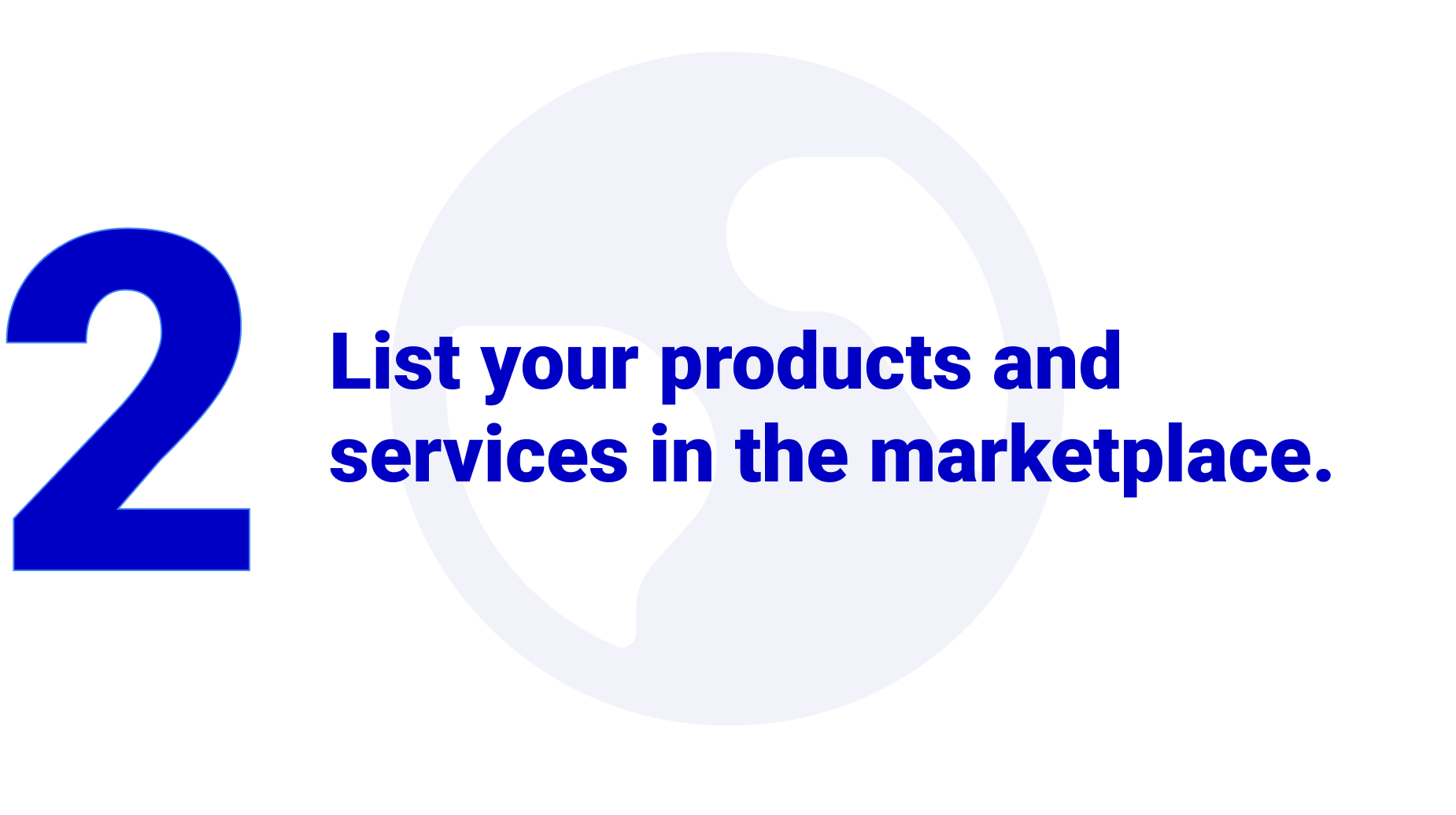
Create a high-fidelity prototype that focuses on vendors of digital health solutions.
Lower the cost of care by reducing time dedicated to cold calling.
Submit the insights gained from usability tests.
Affinity Map
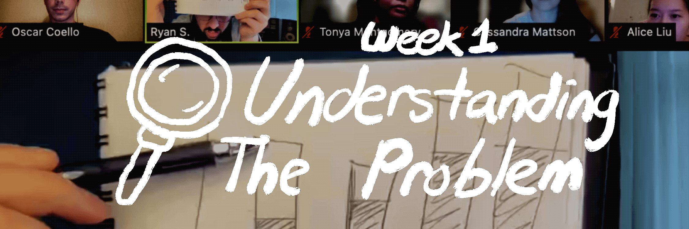
Research shows that the current way to connect with benefits consultants is highly inefficient.
After meeting with the client, we decided to research the problem space individually. After charting common trends in our research, we found the following insights:
Vendors desire an easier method for managing partnerships and viewing real-time data.
A major step for vendors' is to provide information that gains trust from buyers.
Targetting ideal buyers is key to reducing resources lost to cold calling.
Persona
Meet Isaac, the representative of our health solutions providers.
Lightning Demo
I looked at existing solutions that could help vendors like Isaac.
Standard Care Buyer Portal
In order to make sure our prototype fit the brand, I turned to Standard Care's buyer portal for inspiration. My team borrowed the colors and layout for the vendors' side of the app.
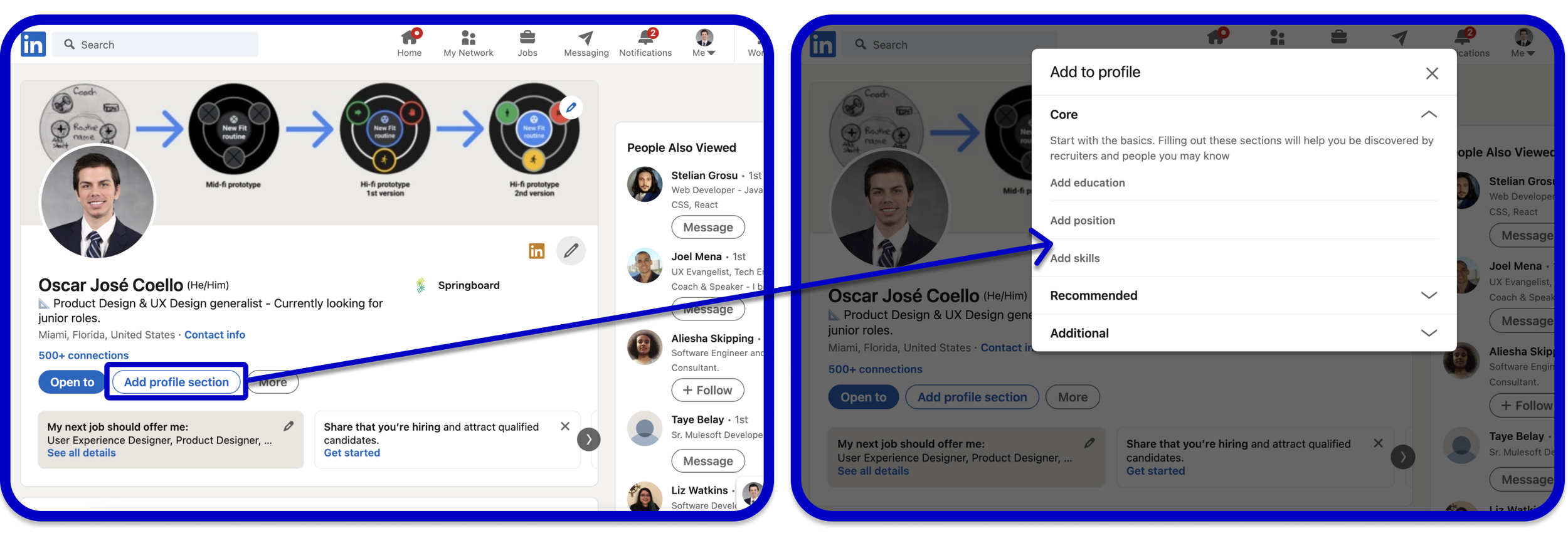
My team wanted to make our app appealing to tech-savvy professionals, so I looked at LinkedIn. I really appreciated LinkedIn's collapsable menu and the ability to choose what sections to add to the user's profile.
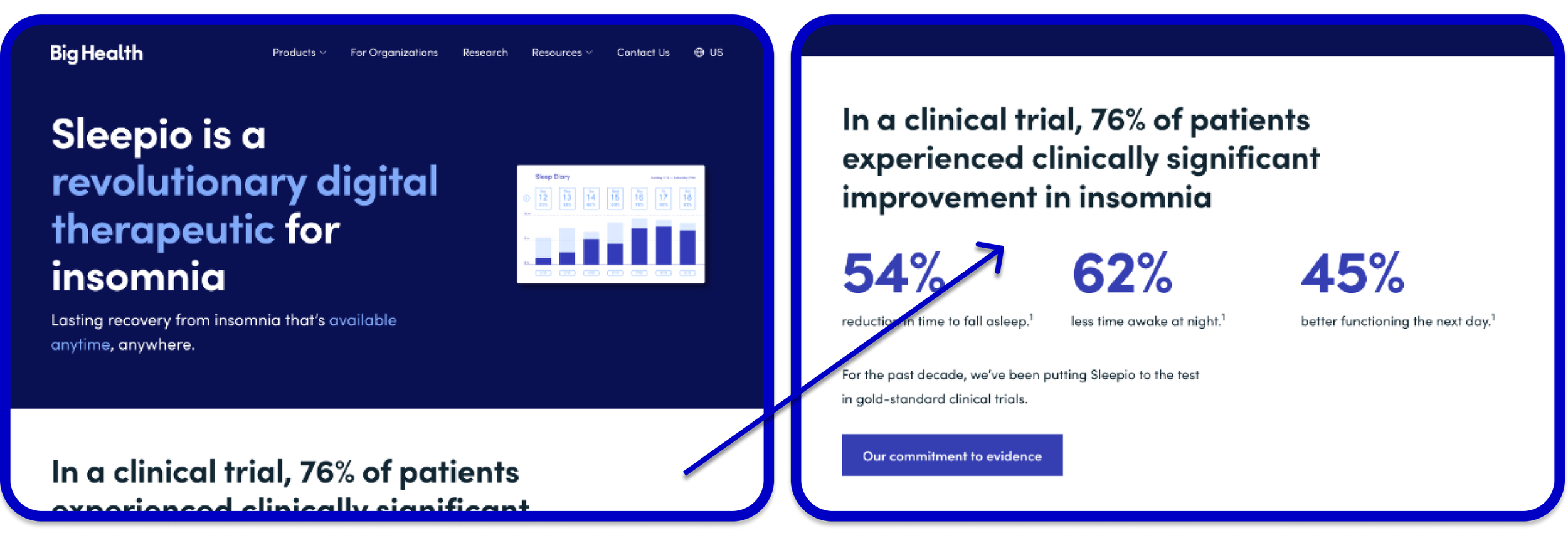
Big Health
My team was at a loss for how to properly advertise the vendors' solutions until I stumbled upon Big Health. I really appreciated the playful, yet professional, language and fonts.
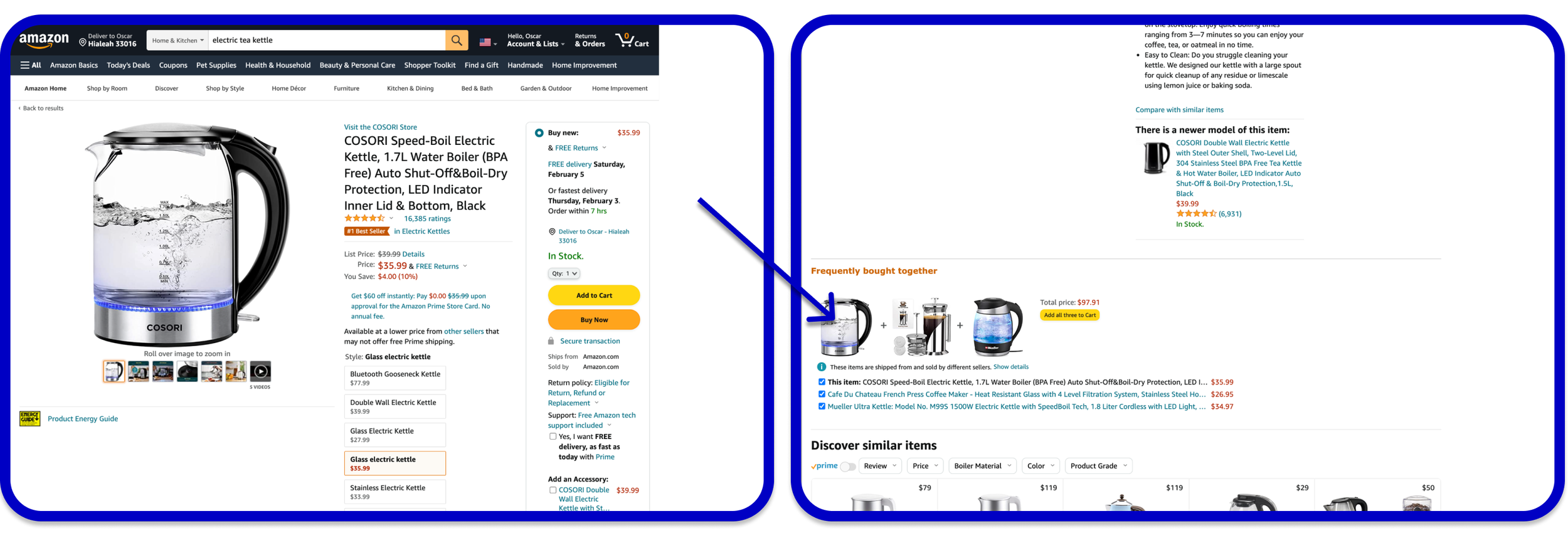
Amazon
We turned to Amazon for ideas for marketplace features. I adapted Amazon's product review system and similar products recommendations for our app, but later had to scrap these features due to technical constraints.
Information Architecture
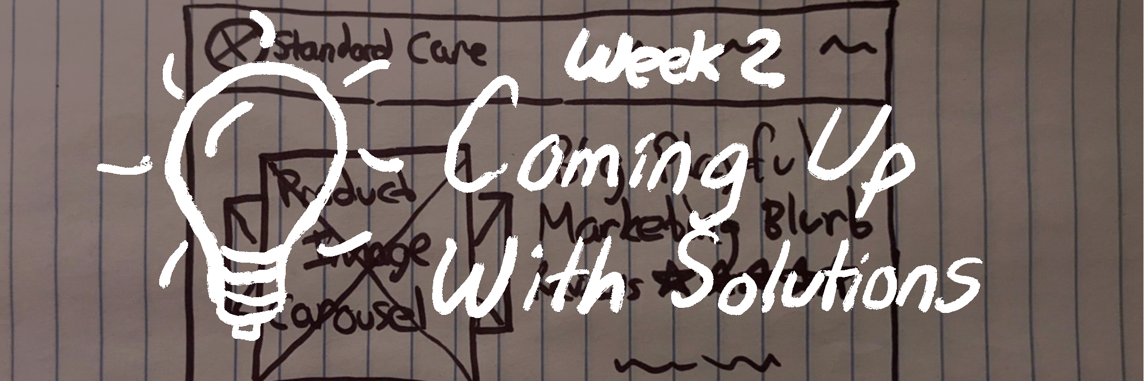
After brainstorming app layouts, we voted on a final blueprint for the vendor portal.
We each created our own maps for the information architecture of the app. After finalizing the layout, we divided the pages evenly for each designer to prototype.
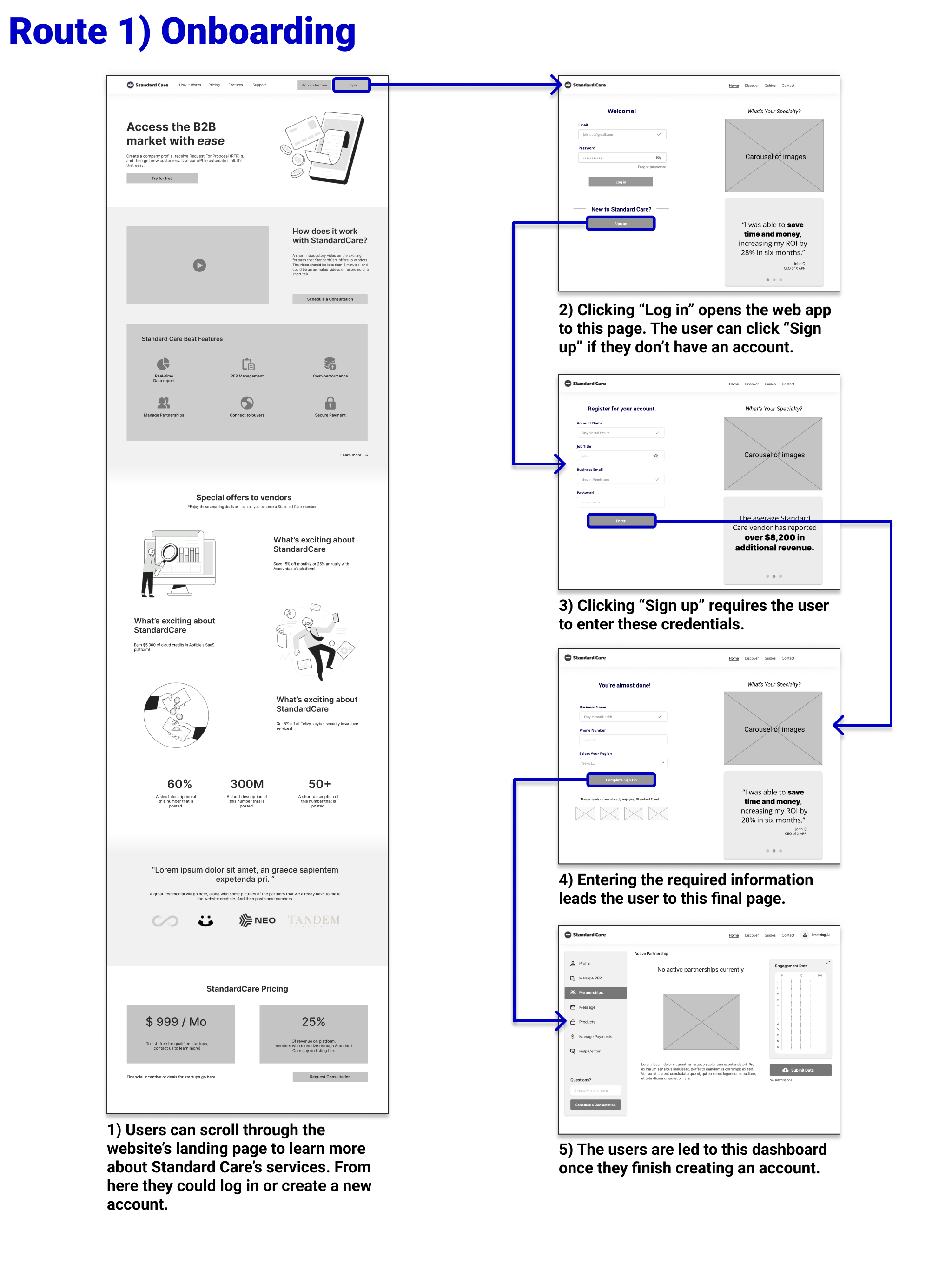
Mid-fi Prototype
We created an interactive prototype to test with working professionals.
Since our client had a small user base at the time, we recruited 10 professionals that received employee health benefits to test our medium fidelity prototypes.
Mid-Fi Wireframes
I gave users these tasks to complete in 30 minutes:
Usability Testing
After the first round of testing, I made adjustments to help users and the app developers.
I conducted 30-minute tests with five of the working professionals we recruited. For the most part, the testers breezed through the tasks. However, there were some issues with personal taste and technical feasability. We made these following changes:
Our design was still required too much development after a second round of testing.
After testing the app with the remaining five working professionals, we discovered most of the usability isues. However, we made these major adjustments to fit the company's brand and technical constraints:
Brand and Style Guide
We adapted the buyer-side style guide and adapted it for users like Isaac.
While creating our design system, we wanted to follow Standard Care’s brand attributes: smart, efficient, and secure. We also wanted to convey the brand personality, which is playful yet trustworthy. Here’s what we came up with:
Usability Testing
This time we recruited health benefits vendors to test our app.
Since we were nearing the final deadline, it was time to tap into Standard Care’s small customer base to get valuable insights. Five health solutions vendors participated in 30 minute test sessions and the following changes were made.
Impact
After the third round of testing, I had a design my client loved.
Once our contract ended, my team handed off the final prototype and research to our client, and we were met with positive feedback. One stakeholder saw the quality of my usability tests and approached me for further work.
“I appreciate your execution of the interviews! There are a few folks I was hoping to continue interviewing on video. If you're open, please shoot me your rate and perhaps a calendly link. And I will share it with them.”
Stakeholder
Here’s the design that landed me more contract work!
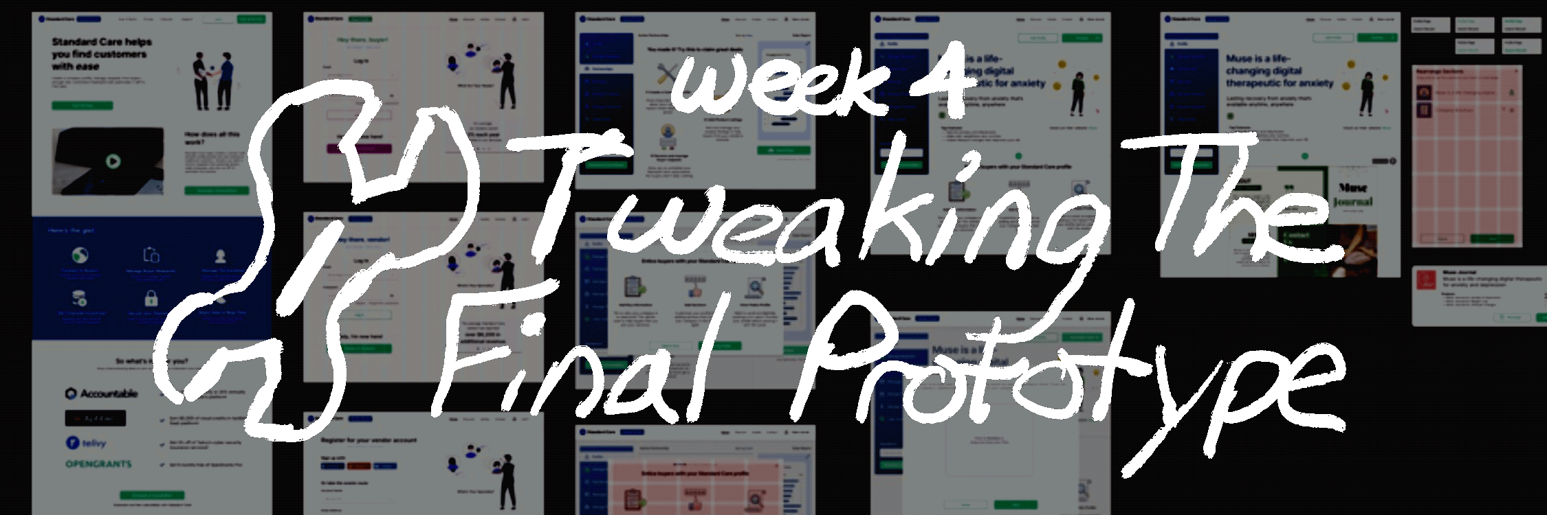
Hi-fi Prototype
Curious about the web app? Knock yourself out! 😊
Reflections and Outcomes
What I would do differently next time:
Communicate with visuals! Many of the incorrect assumptions my team made could have been avoided if we presented visuals with the stakeholder as opposed to trying to communicate using his terminology.
Ask about any technical constraints you can think of. During our project, my team had to eliminate entire features because we found out later that they were not technologically feasible for my client. Consulting a developer is crucial during the kickoff meeting.
Have an agreed set of rules for settling disagreements in the team. This was the best team I have ever had the privilege to work with. We were a well oiled machine, but we one spent a large chunk of time deliberating over colors.
Remember that clients are busy! With all the daily tasks my client had to juggle, we took it upon ourselves to summarize our meeting main points and to reconfirm any deadlines and deliverables discussed.
🥳 You made it! I hope you gained something from this case study.