An uptime page for telecom data
Solo client project
October 2022
I was given one day to design a web page that would clearly display RingCentral’s uptime data so that potential customers could more accurately compare their metrics to that of the competition’s.
The emergency
I was so excited to work with RingCentral, as it was my first big-named client! Finally, I got to see the behind-the-scenes of a popular app that handles just about any telecommunications-related needs: video calls, phone calls, virtual conferences, text messaging, and more. There was a lot of pressure on my end to deliver amazing results, as I wanted to leave a good impression and get hired on full time.
Originally, I was assigned to a team that designs phone-related features. However after my first week, I was suddenly pulled from the team to handle an emergency. As it turns out, RingCentral was losing customers to competitors despite having far better performance metrics. I was tasked with creating an uptime page that helps users quickly and effectively compare these metrics to those of competing apps, and I had one day to do it!
Just enough research
Before jumping into design, I normally review any existing research or do some generative research of my own (à la Standford Design Thinking Process), but the clock was ticking. Instead of my usual user interviews and early usability testing, I opted for rapid-fire stakeholder interviews. With the collective knowledge these executives have of their customer base, I could gain a general understanding of what our users need.
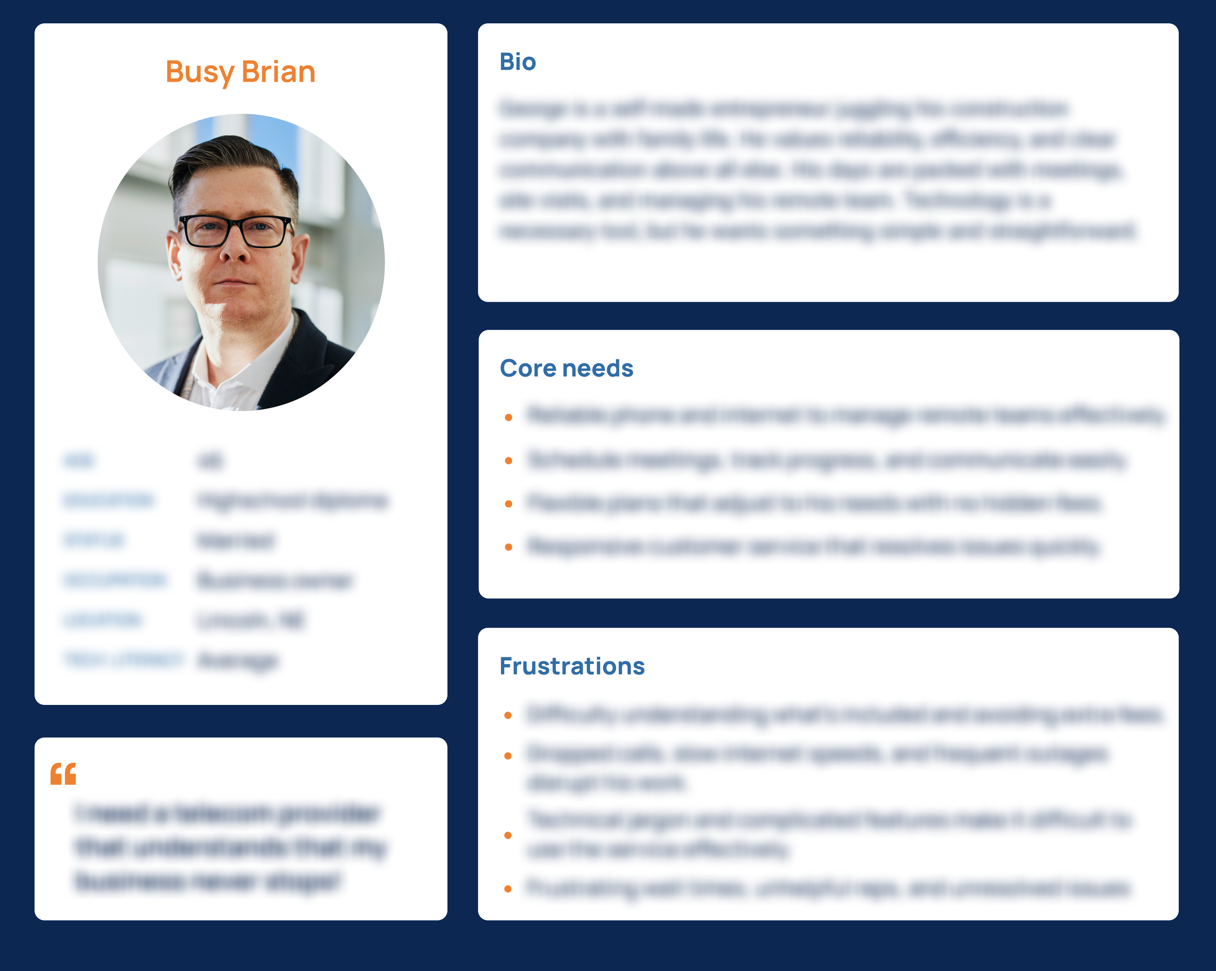
With the information I learned, I was able to generate the user persona pictured above to serve as a representative of our target users. This would be a guide for this project as well as future RingCentral projects. Please don’t ask about the blurred out information, as I am trying to avoid getting taken out by the NDA assassins.
No time to lose
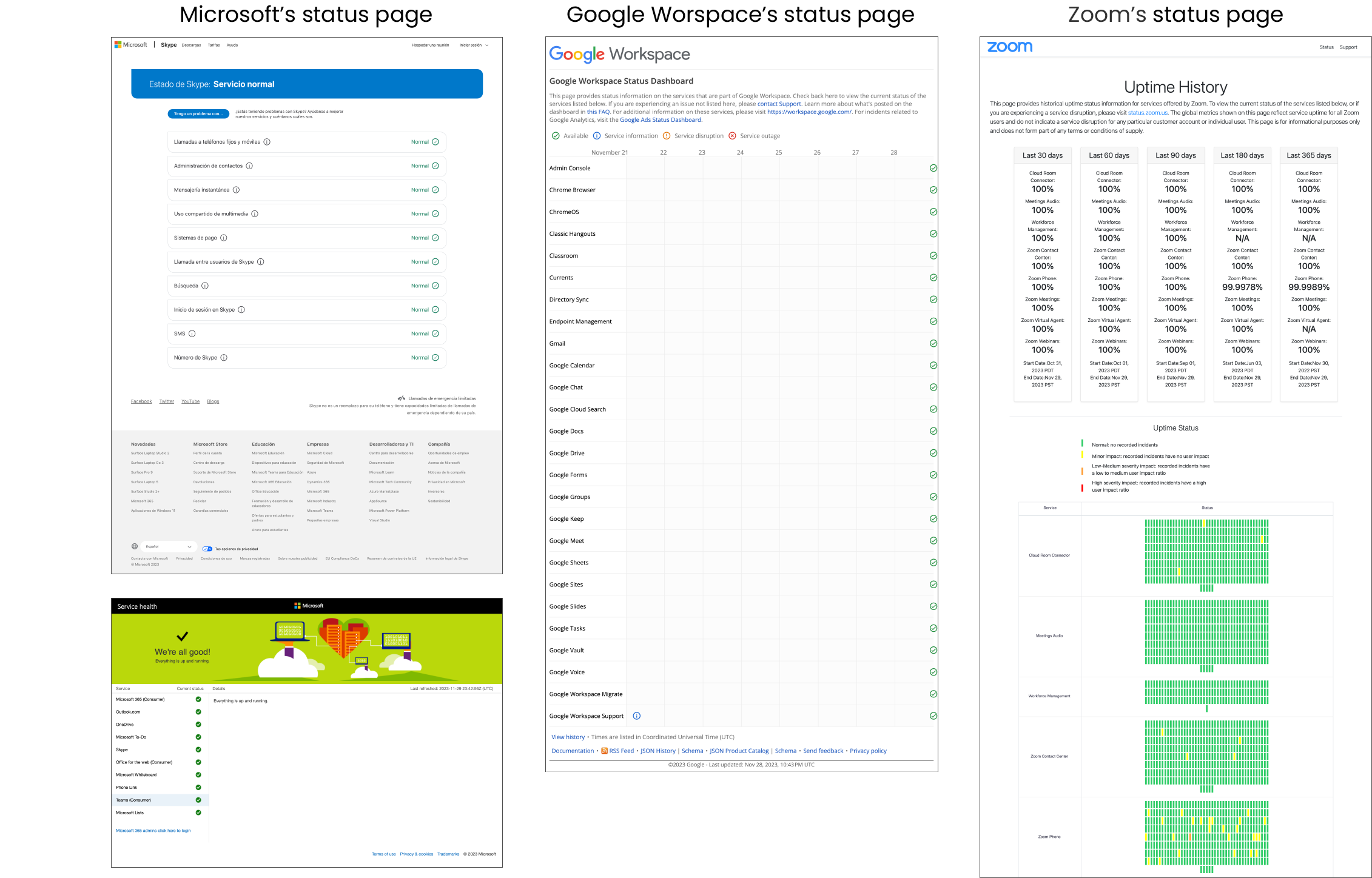
In order to shave additional time off of this project without sacrificing our users’ needs, I opted for lightning demos as a way to use tried-and-true design elements in my project. I referenced uptime pages from Zoom, Microsoft, and Google Workspace to find UI elements that would meet the user needs that were outlined by the stakeholders. Here are the aspects of those websites that I found useful for RingCentral’s users:
The use of colors and symbols to indicate the severity of different statuses.
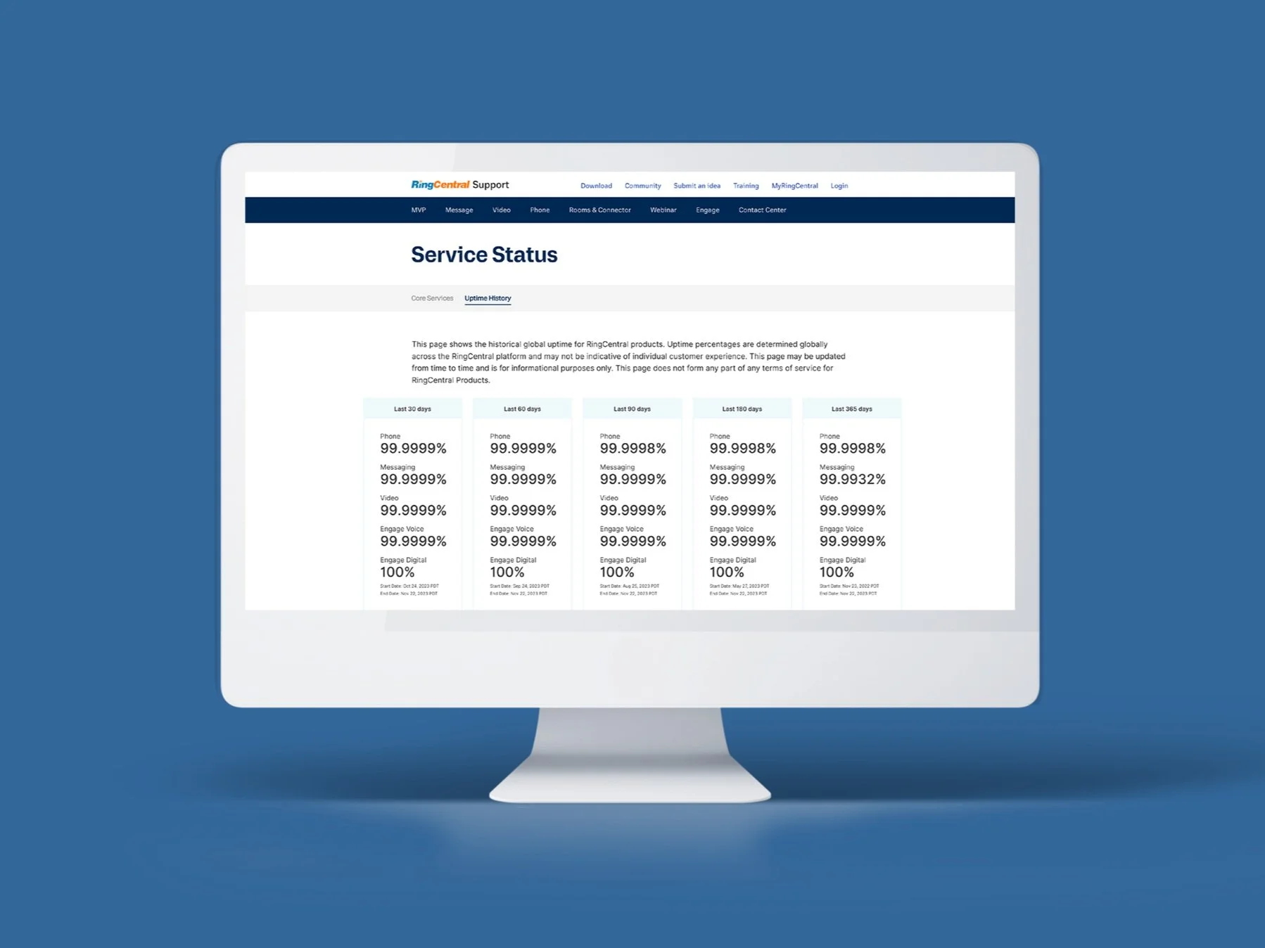
Displaying the uptime data in intervals of 30, 60, 90, 180, and 365 days for quick scannability.
Using shapes to represent the days of the year with tooltips that give additional data with each respective day.
Including the dates of when the information was last updated to improve the credibility of our data.
Making the final tweaks
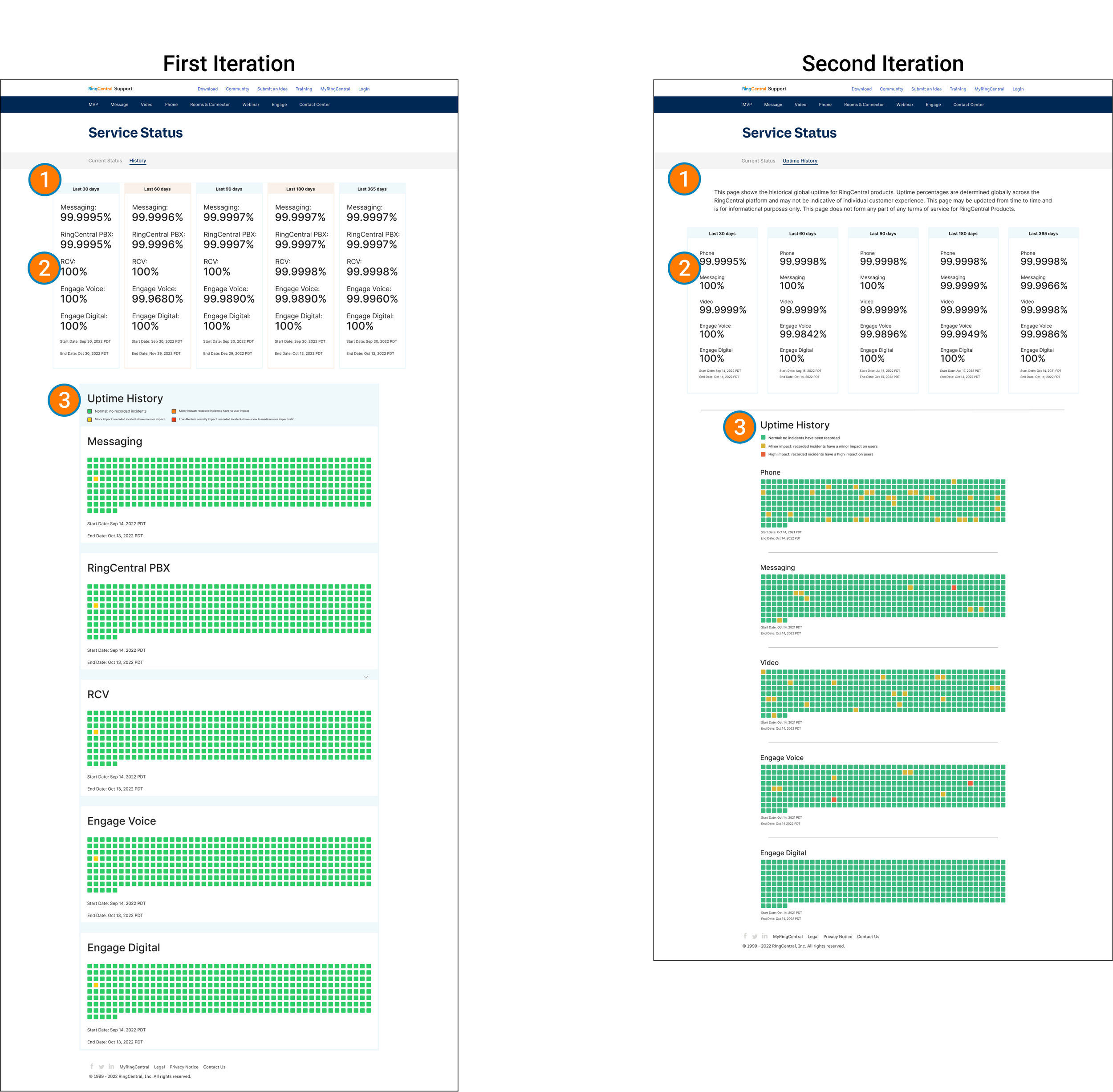
After rapidly prototyping my first design of the uptime page, I wanted to get some immediate feedback. Since testing this design with real users was out of the question, I decided to run this prototype past the director of UX design as well as the other stakeholders that were involved with this project. The deadline was fast approaching, but luckily they did not request any substantial changes. Based on their feedback, these are the changes I made:
A blurb was added to ensure the information was compliant with the company’s policies.
The colors of the columns were changed for consistency, and some product names were changed so that they were more widely recognizeable.
The design of the Uptime History section was changed to have a more minimal appearance and less intense colors.
Ready for handoff
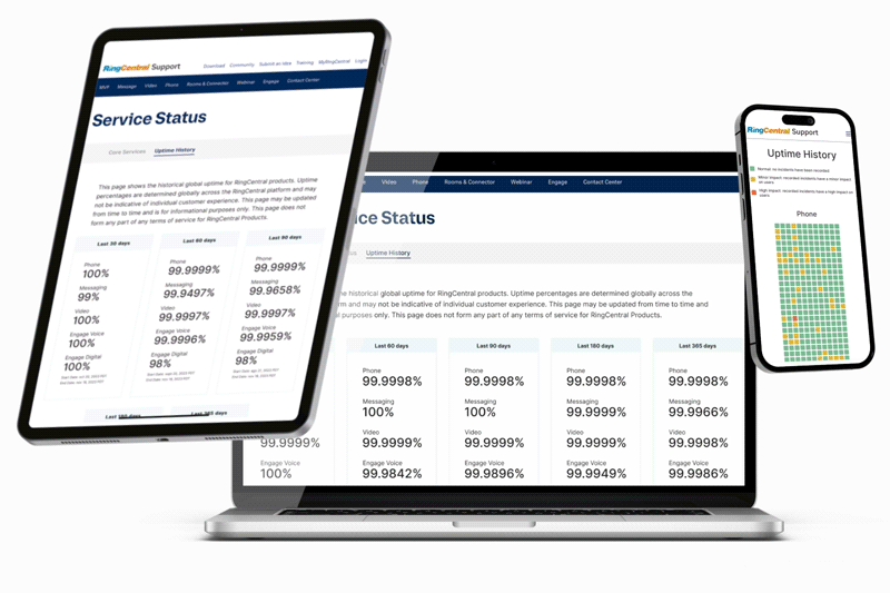
After the final adjustments were signed off by the stakeholders, this design was immediately implemented by the dev team and made live for anyone to see. Now anybody who is considering using RingCentral for their telecom needs can accurately assess how reliable their services are compared to similar softwares. This also further helped the sales team, as they had an accessible resource to use while trying to sell RingCentral’s services to prospective customers.
Although the circumstances of this project were not ideal at first, I am grateful that I had the chance to adapt my process to a faster-paced environment. I was able help RingCentral’s users with minimal time and research and create a page that satisfied the stakeholders. One thing I would have loved to spend time on measuring the impact the design had using Google Analytics data or even seeing how many sales were closed after the implementation of this website. A pivotal webpage such as this would benefit from further research and iterations.